
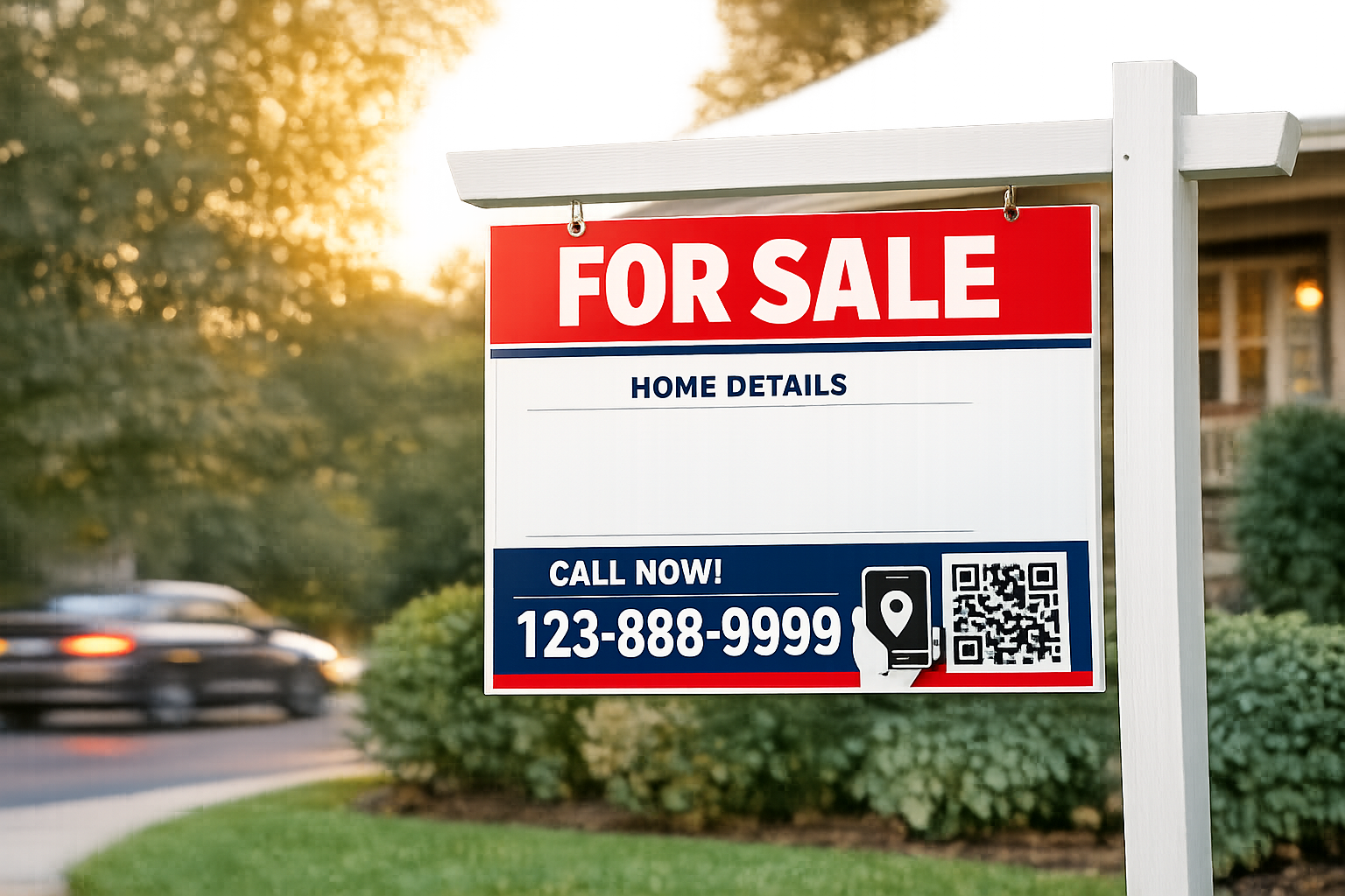
A sign in the yard is not just a formality. It is a 24-7 salesperson that greets neighbors, catches the eye of drive-by buyers, and signals credibility from the street. Even in a search-first market, a well-crafted “For Sale” sign can spark calls, QR scans, and in-person tours that online listings alone might miss. With the right design, placement, and message, that small piece of real estate marketing can shorten days on market and lift perceived value before a single showing begins.
Why a High-Performing “For Sale” Sign Matters
Great property signage does three jobs at once: it creates awareness for people who already love the neighborhood, it builds trust by signaling a professional process, and it converts casual interest into action at the moment curiosity is highest. A clean, legible yard sign turns drive-bys into phone calls, website visits, and QR scans. It also reassures sellers that their listing is getting full, visible representation.
Online exposure is powerful, but the right street-level impression often draws the most motivated buyers. People touring an area on weekends are already pre-qualified by location. Your sign turns that intent into engagement in seconds.
Design Principles That Sell at a Glance
Most real estate signs get about three seconds of attention from someone in a passing car. That means clarity beats cleverness, and design choices must aid fast reading from 25 to 75 feet away.
Size and Layout for Street-Speed Reading
Use a clear hierarchy that someone can parse while moving:
- Top line: “For Sale” or “Open House” in large, high-contrast type.
- Middle: primary hook such as a standout feature or address.
- Bottom: the fastest contact route and a QR code.
As a rule of thumb, plan at least 1 inch of letter height for every 10 feet of viewing distance. On common 18 x 24 inch or 24 x 24 inch panels, the headline should be the biggest element, not the logo.
Typography and Color Contrast That Pop
- Choose bold, simple typefaces. A clean sans serif reads best at speed.
- Maximize contrast. Dark text on white or white on dark is easier to read than mid-tone blends.
- Use one or two brand colors and one accent color. Too many colors look busy and drop legibility.
- Avoid thin strokes, script fonts, and heavy gradients that can blur from a distance.
Messaging That Drives Action
Every element on a home for sale sign should earn its space:
- Primary callout: “For Sale,” “New Listing,” or “Coming Soon.”
- Specifics that spark interest: beds-baths, lot size, or a short feature like “Pool” or “Walk to Transit.”
- Contact and CTA: phone, text keyword, or QR with a short prompt like “Scan for photos and price.”
- Web address: keep it short and readable, ideally a custom URL that redirects to the listing page.
Limit copy. A yard sign is not a flyer. If you include five things, they must be the five that move a buyer to act.
Branding Without Clutter
Brokerage marks and agent brand elements matter for trust and compliance, but they should not overwhelm the message. Keep the logo small enough to preserve hierarchy. Use a single brand color as a framing device or border. Consistency across signs builds recognition around the neighborhood, which lifts inquiry rates over time.
A Clear, Testable Call to Action
Strong CTAs convert curiosity into measurable leads. Examples:
- “Call or text 555-0142 for price and photos.”
- “Scan for 3D tour and open house times.”
- “Message HOME23 to 555-0142 for details.”
Pair each CTA with a tracking method. Use a call-tracking number, unique text keyword, or a QR code with UTM parameters, so you can see exactly how many inquiries the sign generates.
Materials, Durability, and Compliance
A professional sign not only looks good on day one, it still looks good on day thirty. Material choices and weatherproofing protect your brand and your seller’s curb appeal.
Choosing the Right Substrate
- Corrugated plastic (coroplast): affordable and light, best for short-term use and open house directionals.
- Aluminum: rigid, weather-resistant, and long-lasting. Good for reusable panels.
- Aluminum composite material (ACM): durable, flat, and premium looking. Ideal for high-visibility listings.
Invest in sturdy frames or posts that resist bending in wind. A bent frame reads like poor marketing care.
Weatherproofing and Readability
- UV-resistant inks keep reds, blues, and blacks from fading in sun exposure.
- Lamination or clear coats help resist scratching and staining.
- Reflective vinyl or spot-reflective elements improve twilight visibility without electricity.
Local Rules, HOA Guidelines, and Brokerage Standards
Check city ordinances, county rules, and HOA covenants for size, placement, and timing restrictions. Some areas limit the number of directional signs, set distance rules from intersections, or require removal after closing. Keep brokerage-required disclosures and license numbers accurate and legible. A compliant real estate sign protects your listing and your reputation.
Smart Placement That Multiplies Impressions
Even a great design fails if no one sees it clearly. Treat placement as a conversion tactic, not an afterthought.
On-Property Positioning
- Angle the sign slightly toward the flow of traffic on the busiest street.
- Keep the bottom of the panel 12 to 18 inches off the ground for grass clearance and sightline.
- Trim landscaping behind the sign to remove visual noise and shadows.
- Add a small solar spotlight for evening visibility in darker streets.
Directional Signs and Riders
For open houses or hard-to-find properties, directional arrows placed at key turns guide buyers. Use consistent branding and remove them promptly after events. Riders can call out “Pool,” “ADU,” “Owner Financing,” or “Price Reduced,” but avoid stacking too many. One strong rider is better than three weak ones.
Safety, Sightlines, and Courtesy
- Stay clear of sidewalks, fire hydrants, and visibility triangles at corners.
- Do not block driveways or mailboxes.
- Anchor signs to resist tipping during wind or storms.
Tech Integration That Turns Views Into Leads
Blend classic yard sign visibility with simple tech that captures intent instantly.
QR Codes That Work in the Real World
- Make the code large enough to scan from the sidewalk. A practical rule is code size near 1 inch for 3 feet of scanning distance.
- Use a short URL and high-contrast code to prevent scan errors.
- Send traffic to a fast, mobile-first listing page with photos, price, and a one-tap inquiry form.
- Add UTM parameters so you can track scans in analytics.
Call Tracking and Text Keywords
Set up a dedicated phone number that forwards to your main line and logs calls. Offer a text keyword that auto-replies with a link to the listing and captures the mobile number for follow-up. This gives you both response speed and accurate attribution.
Landing Page Essentials
- Fast load time and clean photo gallery.
- Prominent price and key features above the fold.
- Short contact form or tap-to-call button.
- Map and neighborhood highlights for local context.
- Clear privacy language and no intrusive pop-ups.
Cost, ROI, and How to Measure Performance
The beauty of a yard sign is its low cost relative to its reach. A thoughtful setup can be reused across multiple listings and measured like any digital ad.
What to Budget
- Panels: corrugated plastic at the low end, aluminum or ACM for premium, reusable panels.
- Frames and posts: budget H-frames for temporary use or a professional post-and-arm for high curb appeal.
- Add-ons: riders, QR stickers, solar spotlight, and protective lamination.
Higher-quality materials pay off when they preserve brand polish through wind, rain, and sun.
Metrics That Matter
- Inbound calls and texts tied to the sign’s tracking number or keyword.
- QR scans and landing page sessions with UTM source labeled “yard-sign.”
- Open house walk-ins who mention the sign.
- Days on market compared with similar listings using the same brand standards.
Simple A-B Tests
- CTA language: “Call Now” vs. “Text for Photos.”
- Rider content: “New Price” vs. “Open House Sunday.”
- Contrast tweaks: white panel with dark type vs. dark panel with white type.
Change only one element at a time and track leads over a set period to learn which version performs best.
Common Mistakes That Kill Curb Appeal
- Overstuffed copy that shrinks the phone number and CTA.
- Low-contrast color choices that vanish from the street.
- Too-small fonts that no one can read at driving speed.
- Wobbly frames, sun-faded panels, or peeling vinyl that signal neglect.
- QR codes that lead to slow pages or generic homepages instead of the listing.
- Ignoring local sign rules and angering neighbors or HOAs.
- Leaving signs out after a sale, which hurts brand trust.
A Practical Step-by-Step Sign Build
- Clarify the goal: drive calls, drive scans, or promote an event.
- Define the message hierarchy: headline, one hook, one contact method, QR, and required branding.
- Sketch the layout at actual scale to confirm letter sizes and spacing.
- Choose materials for expected time-in-yard and weather conditions.
- Create a mobile-first landing page and add tracking tags.
- Generate and test a high-contrast QR code from different distances.
- Proof for compliance, spelling, and phone number accuracy.
- Order from a reliable vendor and inspect materials on arrival.
- Install at the right angle and height, secure against wind, and add lighting if needed.
- Monitor calls, scans, and page traffic. Adjust riders or CTA if response is soft.
Turn a Simple Yard Sign Into a Silent Sales Pro
A crisp, readable design, placed where buyers can see it, with a clear next step, turns a basic “For Sale” sign into a measurable lead engine. Treat the panel as a priority marketing asset, not an afterthought. Keep the message focused, choose materials that hold up, and track the results like any other campaign. Do that, and your sign will not just mark a listing. It will help sell it.
Leave a Reply